AGRO Pro — Packaging Design
AGRO Pro — Packaging Design
Overview
I created the packaging concept for AGRO Pro, a pasta brand produced in Burkina Faso, focusing on integrating African cultural elements and ensuring compatibility with local flexographic printing standards.
Challenge
Design visually striking, culturally resonant packaging with a flexible system for different pasta types, limited to 8 Pantone colors for consistent quality printing.
Solution
Inspired by traditional African clothing and ornaments, I developed a modular design system featuring layered, asymmetrical blocks separated by white space. Different product categories are differentiated through block shapes, individual background colors, and unique color combinations. The brand logo was refined for simplicity, improved readability, and emphasis on the product's local origin.
My Role
Brand and Packaging Designer — logo refinement, packaging system development, color strategy, prepress file preparation.
Tools Used
- Adobe Illustrator
- Photoshop
- Figma
Key Elements
- African-inspired ornament system with mirrored blocks
- Color palette based on Burkina Faso's flag and local nature (8 Pantone colors)
- Product differentiation by shape and background color
- Flexographic printing optimization for mass production
Design Process
The design process began with extensive research into African visual culture, particularly focusing on traditional textiles, patterns, and ornaments. I wanted to create a packaging system that would feel authentically African while meeting modern packaging requirements and technical constraints.
The logo refinement was an important first step, as the original logo contained botanical elements that were difficult to reproduce consistently in print. I simplified the design while maintaining brand recognition, reducing the color count from 3 to 2 and adding "BURKINA FASO" to emphasize the local origin.
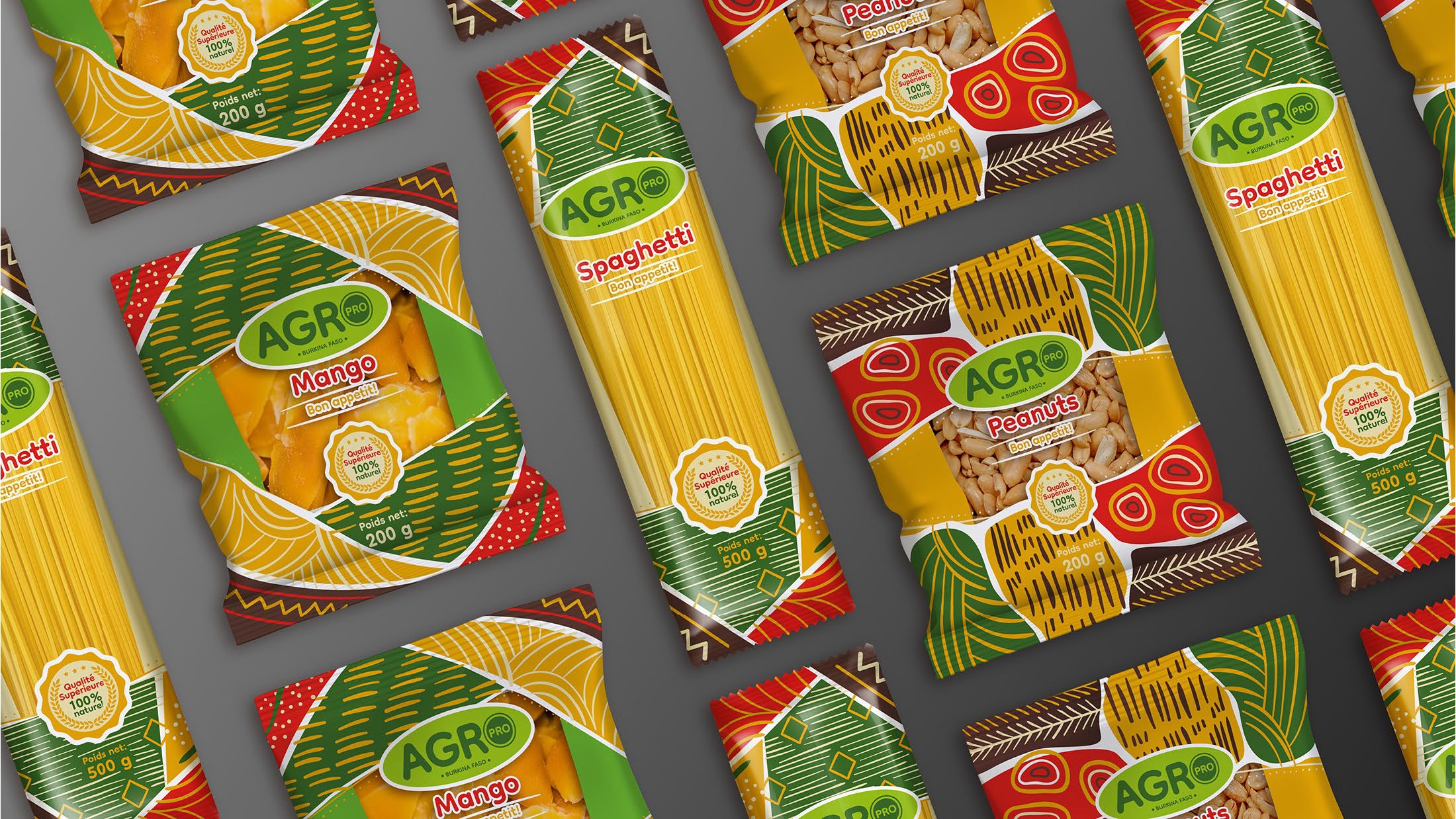
For the packaging system, I developed a modular approach using ornament blocks inspired by African textiles. Each product category features unique block shapes that reflect the product form—straight edges for pasta, softer rounded edges for dried fruit, and oval shapes for nuts. The background colors also differentiate product categories while staying within a warm tone range that harmonizes with the ornament colors.
The color palette was carefully selected to align with the Burkina Faso flag colors while meeting the technical limitation of 8 Pantone colors for flexographic printing. This printing method was chosen for its ability to produce vivid, saturated colors with consistent quality compared to CMYK, which was important for maintaining the vibrant African-inspired aesthetic.
Outcome
The final packaging system successfully balances cultural authenticity with practical functionality. The modular design approach allows for easy adaptation across different product types while maintaining a cohesive brand identity. The bright, warm colors and distinctive patterns help the products stand out on retail shelves, and the simplified logo ensures consistent reproduction across all packaging formats.
The client was particularly pleased with how the design system could be easily expanded to accommodate new product lines in the future, and how the packaging effectively communicates the brand's African heritage to consumers.
Project Gallery
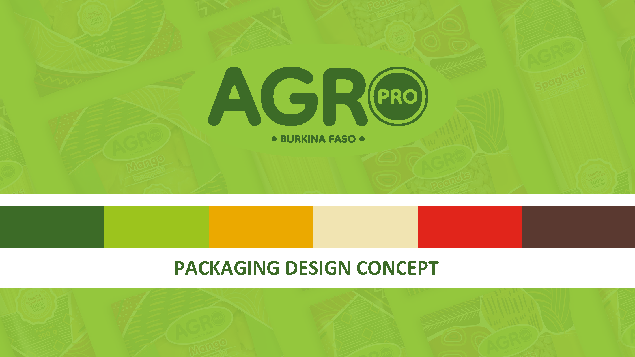
01 - Packaging design concept overview
02 - Logo refinement for better readability and recognition
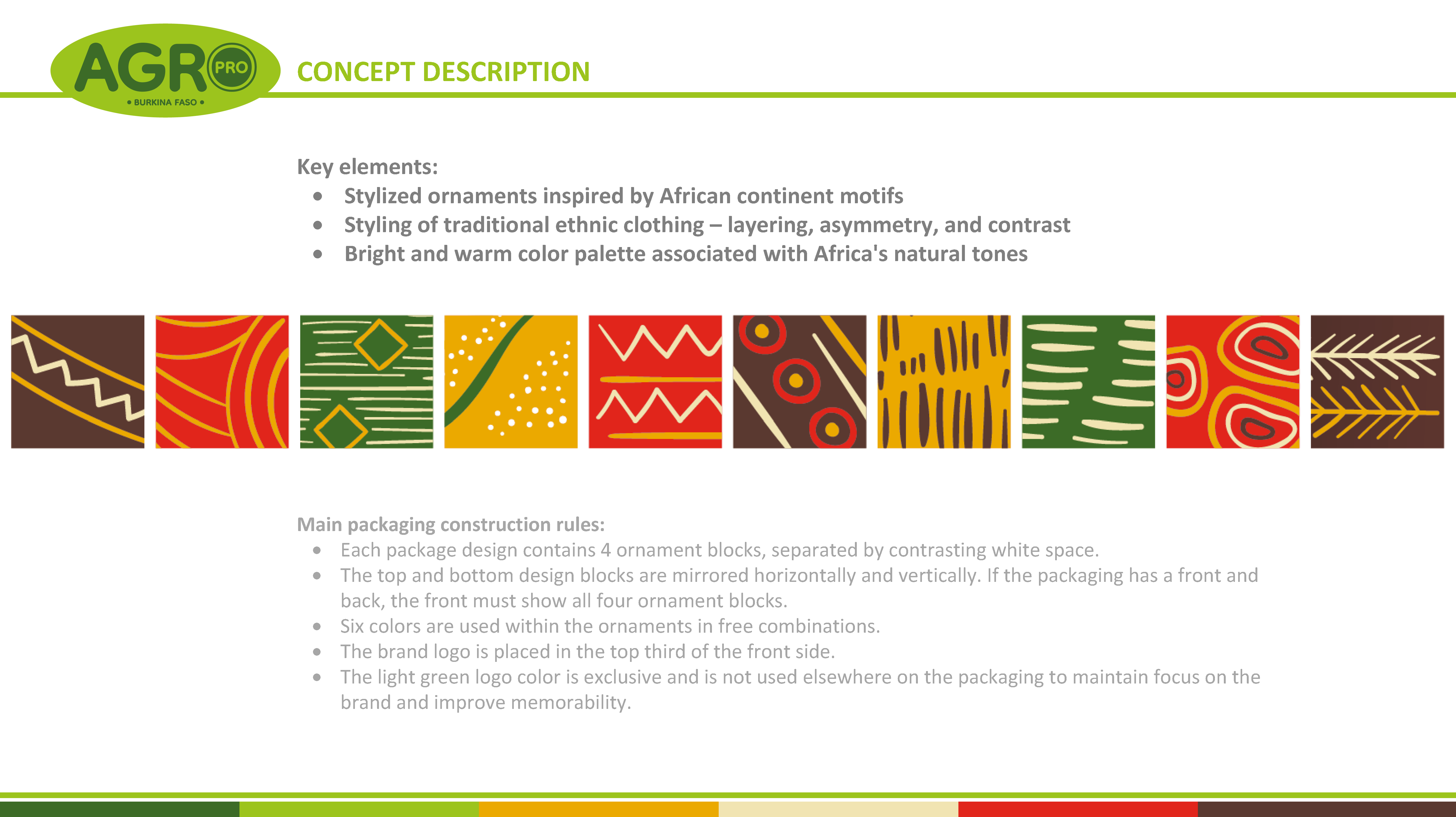
03 - Concept description with African-inspired ornament patterns
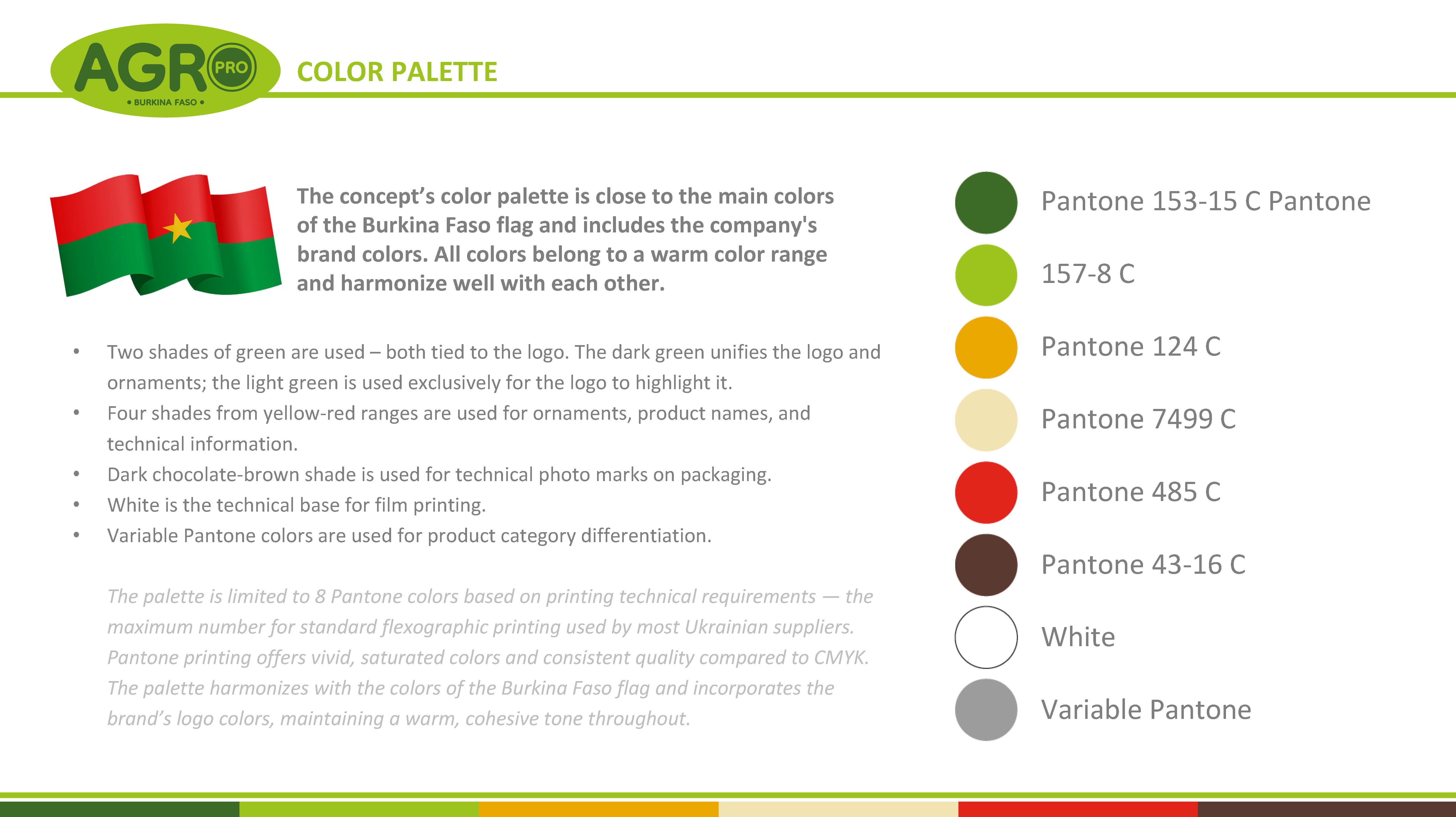
04 - Color palette based on Burkina Faso flag and brand colors
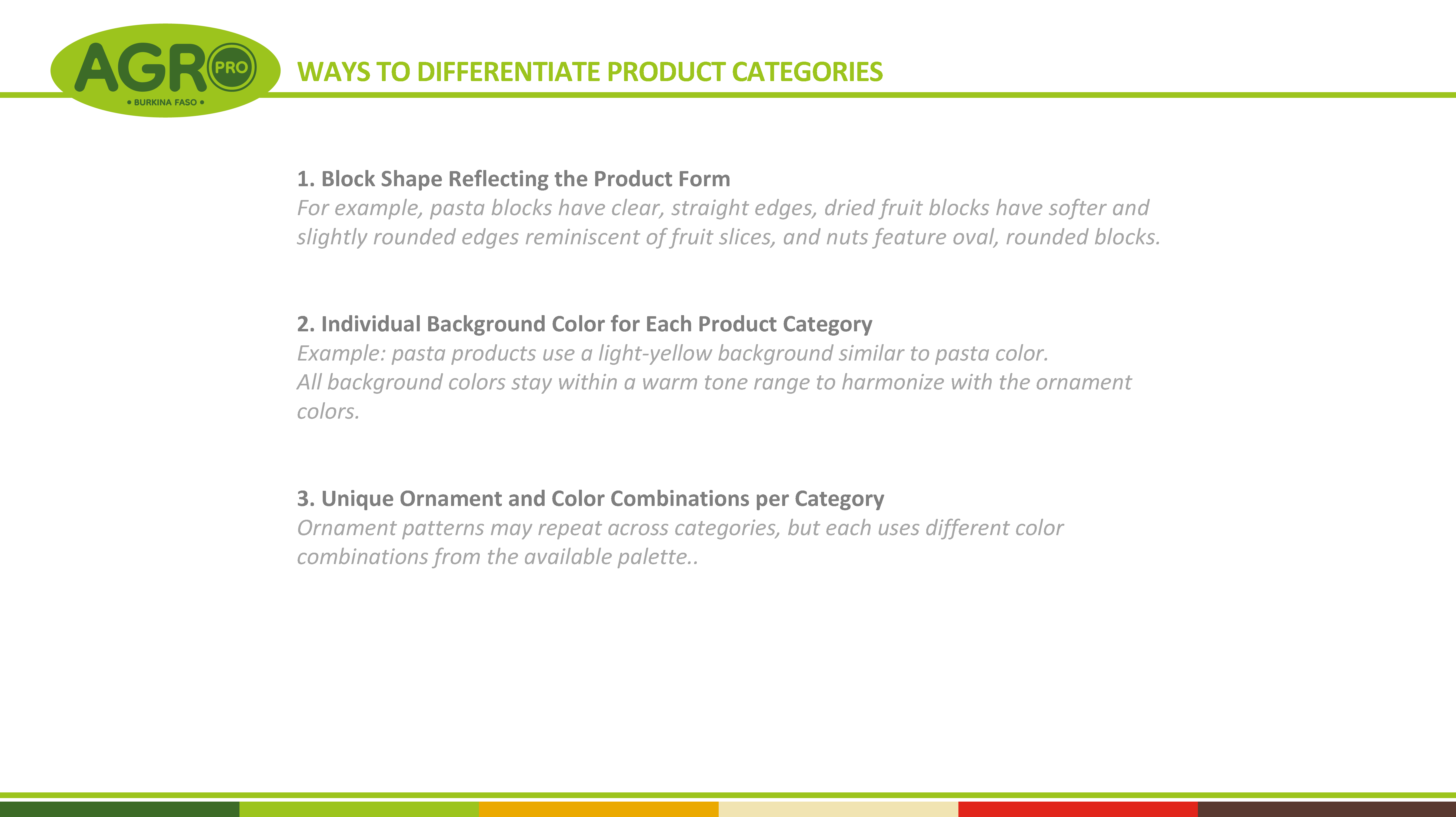
05 - Ways to differentiate product categories through shape and color
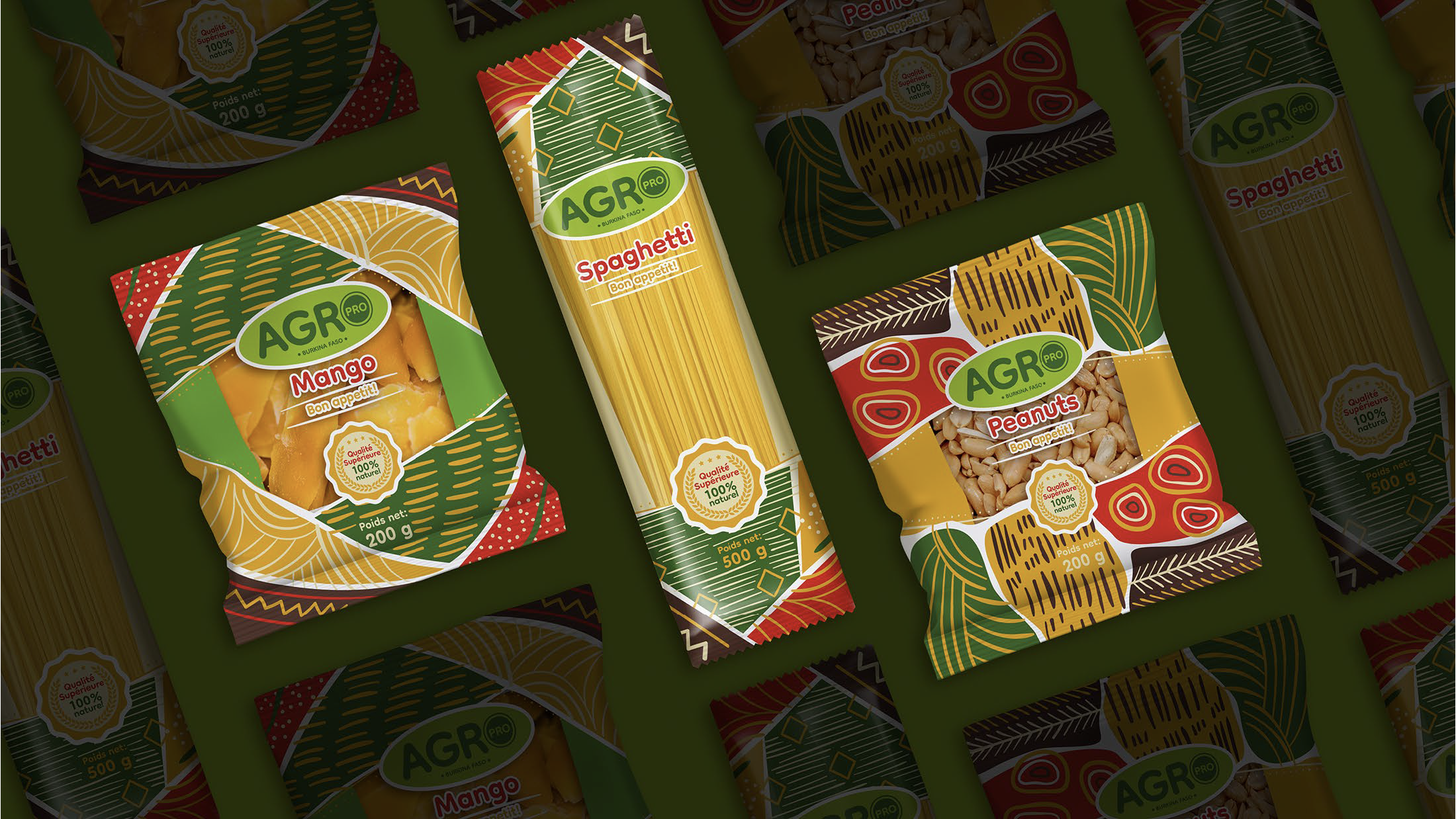
06 - Packaging display showing different product categories

07 - Complete packaging collection with various product types