Designtrist — Email Campaign Design

Designtrist — Email Campaign Design
Overview
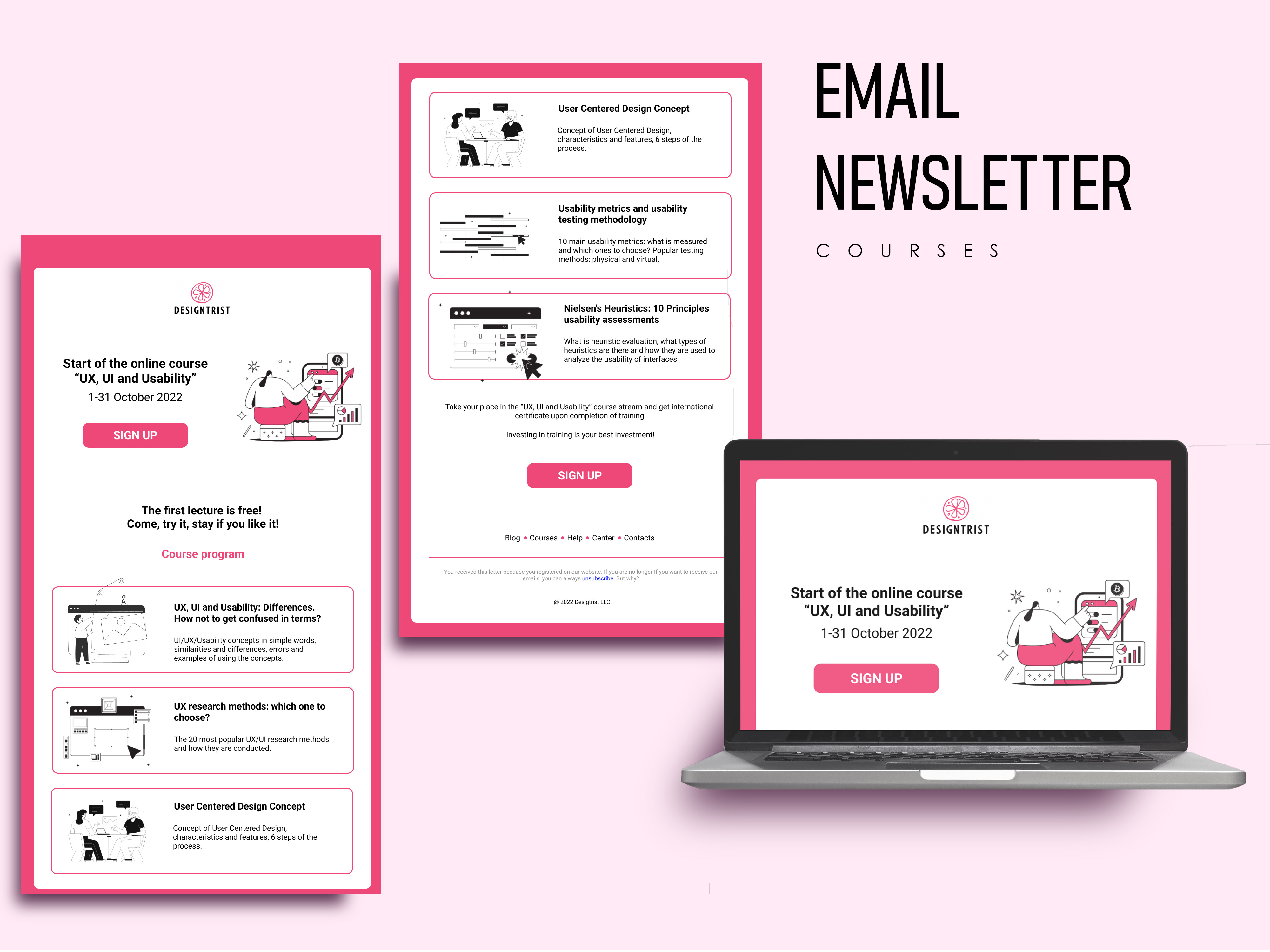
Created an engaging email design for Designtrist's online course promotion "UX, UI and Usability," aimed at attracting new students and increasing sign-ups.
Challenge
Design a visually clean, easy-to-navigate email that effectively communicates the course program while maintaining brand consistency and motivating users to register.
Solution
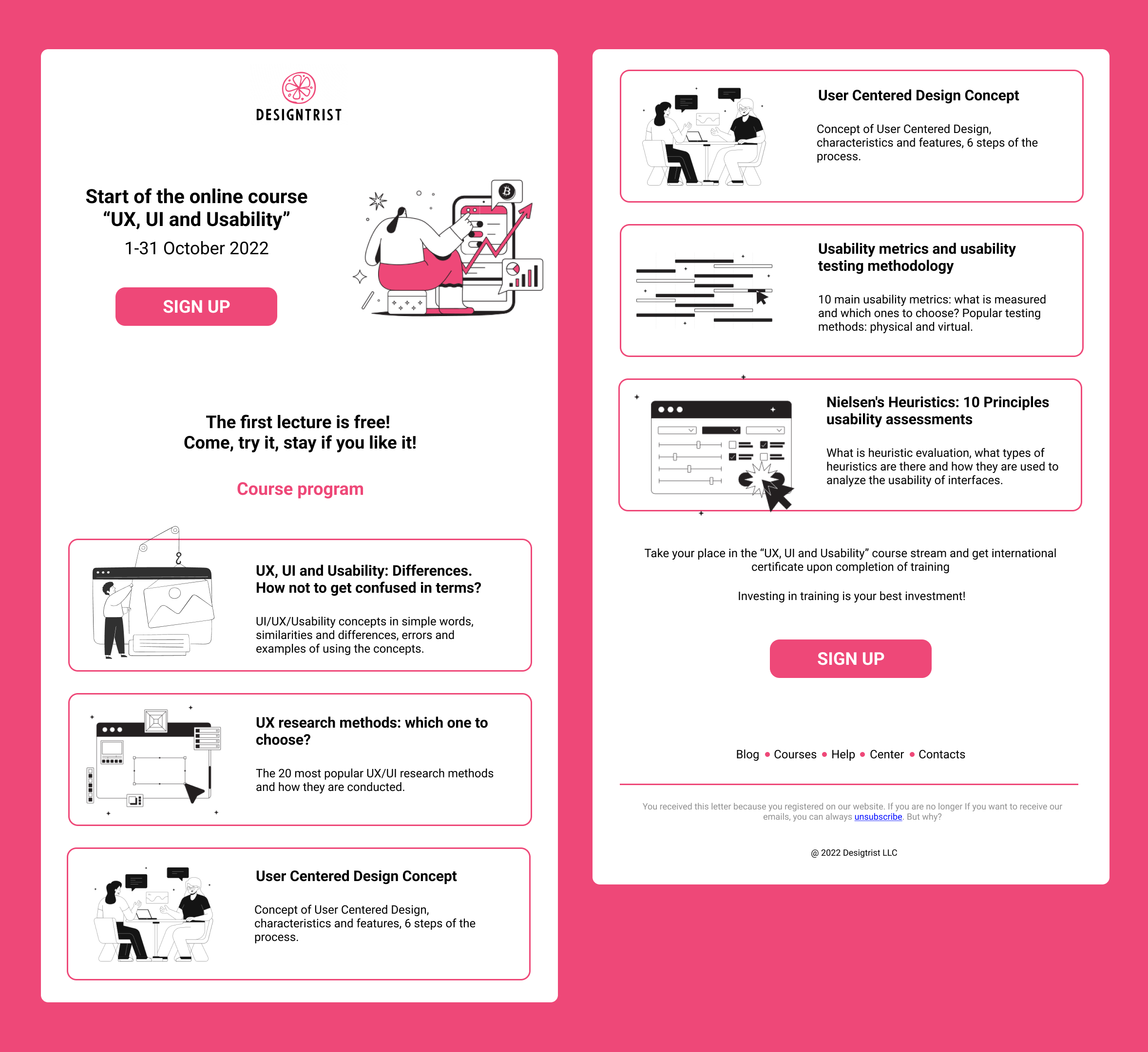
Developed a bright, structured email layout using a limited color palette, clear call-to-action buttons, and custom illustrations to enhance readability and engagement. The design highlights the main course modules and simplifies the user journey towards sign-up.
My Role
Graphic Designer — email layout design, icon and illustration integration, typography and color system selection.
Tools Used
- Figma
- Adobe Illustrator
Key Elements
- Organized, easy-to-follow course structure
- Eye-catching call-to-action buttons
- Custom minimalist illustrations
- Clear hierarchy and visual balance
Design Process
The design process began with a thorough understanding of the course content and target audience. I worked closely with the Designtrist team to identify the key selling points of the course and determine the most effective way to present them in an email format.
Email design presents unique challenges due to varying device sizes, email client limitations, and the need to capture attention quickly. I approached this by creating a modular design with clear sections that would render well across different platforms while maintaining visual interest.
The color palette was carefully selected to align with Designtrist's brand while adding vibrancy that would stand out in crowded inboxes. I used a combination of bright accent colors against clean white space to create visual rhythm and guide the reader through the content.
Custom illustrations were created to represent each course module, providing visual cues that complement the text and make the content more engaging and memorable. These illustrations follow a consistent minimalist style that adds personality without overwhelming the design.
Email Structure
The email was structured into several key sections:
- Header: Bold headline and course title with a supporting image to grab attention
- Introduction: Brief overview of the course and its benefits
- Course Modules: Visual breakdown of the curriculum with icons and brief descriptions
- Instructor Bio: Short introduction to establish credibility
- Pricing and Dates: Clear presentation of course schedule and cost
- Call-to-Action: Prominent registration button with urgency messaging
Outcome
The email campaign exceeded expectations, achieving significantly higher engagement metrics than industry standards. The open rate reached 32% (compared to the industry average of 21%), and the click-through rate to the registration page was 12%.
Most importantly, the client reported a 40% increase in course sign-ups compared to previous campaigns. Feedback from users indicated that the clear presentation of information and engaging design were key factors in their decision to register for the course.
The design system created for this email has since been adapted for other course promotions, creating a consistent and recognizable template that continues to perform well for Designtrist's marketing efforts.
